Make a Ripple Effect on a Button with a Gradient Background in HTML, CSS & JavaScript

Sunday, September 01, 2024

Currency Converter Preview

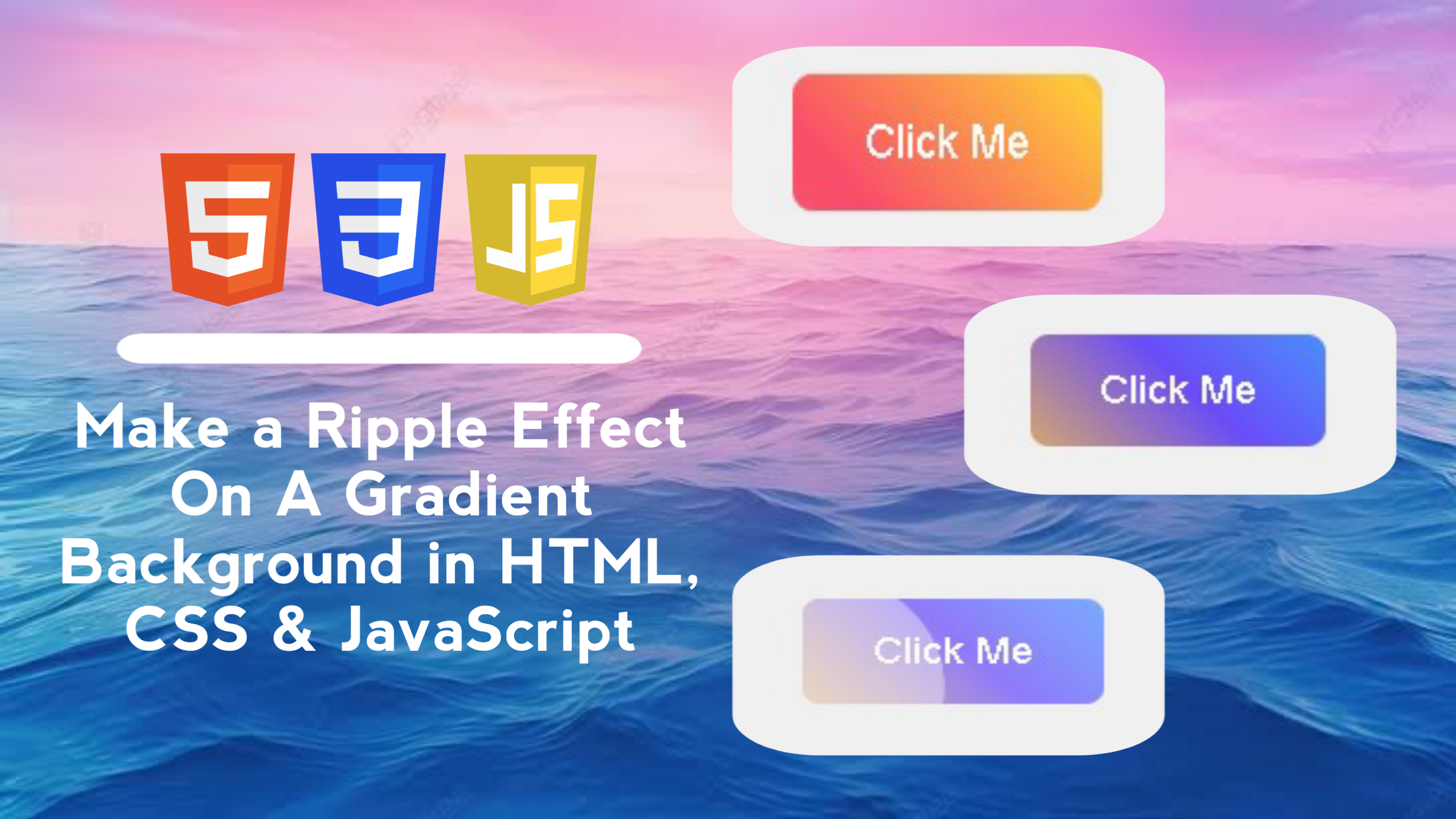
Create an interactive Button with a Ripple Effect when clicked, which has a dynamic color gradient background. The ripple effect provides interesting visual feedback to users when they interact with the button.

In this blog post, I will walk you through creating an interactive button with an attractive ripple effect and gradient background using HTML, CSS, and JavaScript. We will create a button with a dynamic gradient background that will create a ripple effect when clicked.

  • HTML: Basic structure for buttons and containers.
  • CSS: Visual styles for the button, including a changing gradient background and an animated ripple effect.
  • JavaScript: Logic to handle the ripple effect when the button is clicked, including dynamic creation and removal of ripple elements.
By following this tutorial, you will be able to add interactive and aesthetic elements to your user interface, enhancing the user experience by providing responsive visual feedback. We will touch on aspects such as gradient transitions when the button is hovered and ripple animations that give it a modern and attractive look.

Join us to create buttons that are not only functional but also captivating with stunning visual effects!

As you work on this project, you’ll learn how to structure and style websites effectively to ensure they look great on all devices.

Key Features:

  1. Interactive Ripple Effect: The button displays a subtle and engaging ripple effect every time it is clicked, providing responsive visual feedback to the user.
  2. Dynamic Gradient Background: The button comes with a multi-colored gradient background that changes direction on hover, creating an eye-catching and modern visual effect.
  3. Smooth Transitions: Using CSS transitions makes the background changes and ripple effects feel more natural and blend in with the overall design of the button.
  4. Responsive Design: The ripple effect automatically adjusts its size and position based on where the user clicks on the button, making it an interactive and responsive element.
  5. Easy Customization: Background colors, button sizes, and animation durations are easily customizable, so you can adapt the design to fit the look of your project or website.
  6. Minimal Use of JavaScript: Simple and efficient logic using JavaScript to manage the ripple effect, without the need for external libraries or additional frameworks.

With these features, the ripple button project with gradient background can give a professional touch to your user interface!

Why Make a Ripple Effect on a Button with a Gradient Background in HTML, CSS & JavaScript?

    By creating a ripple effect project on a button with a gradient background using HTML, CSS, and JavaScript, you will gain the following skills:

    • HTML: Understanding how to structure the markup needed to apply visual effects to interactive elements such as buttons.
    • CSS: Learn how to apply complex visual styles, including the use of gradient backgrounds, transitions, and animations. You'll learn how to create a ripple effect with CSS and how to customize a button design for a more engaging look.
    • JavaScript: Hone skills in adding interactivity with JavaScript, including logic to create and manage dynamic ripple elements based on user interactions.
    • Interactive Design: Understand how to integrate responsive and dynamic visual effects to enhance the user experience and provide engaging visual feedback when buttons are clicked.
    • Transitions and Animations: Learn to apply CSS transitions and animations to create smooth and engaging ripple effects, and manage animation duration and effects with JavaScript.

    This project will not only improve your technical skills in web development, but also give you a better understanding of how to combine HTML, CSS, and JavaScript to create professional and aesthetic user interface elements.

Steps to Make a Ripple Effect on a Button with a Gradient Background in HTML, CSS & JavaScript

    Here are the steps to create a ripple effect on a button with a gradient background using HTML, CSS, and JavaScript:

    1. Create HTML File

    • Create an HTML file with a button element inside the container. Add attributes and classes to mark the button that will be given the ripple effect.
index.html
                            
<!DOCTYPE html>
<!-- Coding By CodingIndo - https://codingindo.vercel.app/ -->
<html lang="en">
<head>
    <!-- Meta charset to define character encoding -->
    <meta charset="UTF-8">
    <!-- Meta viewport to set responsive display -->
    <meta name="viewport" content="width=device-width, initial-scale=1.0">
    <!-- Title for page title -->
    <title>Button Ripple Effect</title>
    <!-- Stylesheet link to link CSS files -->
    <link rel="stylesheet" href="styles.css">
</head>
<body>
    <!-- Container for ripple effect button -->
    <div class="button-container">
        <!-- Button with ripple effect -->
        <button class="ripple-button">Click Me</button>
    </div>
    <!-- Script to link JavaScript files -->
    <script src="script.js"></script>
</body>
</html>


Explanation

Number Line of Code Explanation

    2. Create CSS File

    • Style the button with a dynamic gradient background and a ripple effect that is visible when the button is clicked.
    • The background gradient is expanded with background-size to create a smooth transition effect when the button is hovered.
    • The ripple effect is added using a pseudo span element which will animate to provide a visual effect when the button is clicked.
style.css
                            
/* Sets the body display to be centered and have a background color */
body {
    display: flex;
    justify-content: center;
    align-items: center;
    height: 100vh;
    margin: 0;
    background-color: #f0f0f0;
}

/* Sets the relative position for the button container */
.button-container {
    position: relative;
}

/* Set the appearance of the ripple button */
.ripple-button {
    position: relative;
    overflow: hidden;
    background: linear-gradient(45deg, #ff6b6b, #f94d6a, #ffca3a, #6a4df9, #3ab7ff);
    background-size: 300% 300%;
    border: none;
    border-radius: 8px;
    padding: 15px 30px;
    color: white;
    font-size: 18px;
    cursor: pointer;
    outline: none;
    transition: background-position 1s;
}

/* Sets the hover effect on the ripple button */
.ripple-button:hover {
    background-position: right center;
}

/* Sets the after effect on the ripple button */
.ripple-button::after {
    content: '';
    position: absolute;
    border-radius: 50%;
    width: 100px;
    height: 100px;
    background-color: rgba(255, 255, 255, 0.6);
    opacity: 0;
    transform: scale(1);
    transition: transform 0.5s, opacity 1s;
}

/* Sets the ripple span display on the button */
.ripple-button span.ripple {
    position: absolute;
    border-radius: 50%;
    background-color: rgba(255, 255, 255, 0.5);
    transform: scale(0);
    animation: ripple-animation 0.6s linear;
    pointer-events: none;
}

/* Set the ripple animation */
@keyframes ripple-animation {
    to {
        transform: scale(4);
        opacity: 0;
    }
}


Explanation

Number Line of Code Explanation

    3. Create JavaScript File

    • Add a JavaScript script to handle the ripple effect logic. When the button is clicked, a span element with the class .ripple.
    • Once the animation is complete, the ripple element is removed from the DOM to prevent stacking of elements.
script.js
                            
// Add an event listener for clicks on elements with class 'ripple-button'
document.querySelector('.ripple-button').addEventListener('click', function (e) {
    // Create a new 'span' element for the ripple effect
    const ripple = document.createElement('span');
    // Get the clicked button element
    const button = e.currentTarget;
    // Get the size and position of the button
    const rect = button.getBoundingClientRect();
    // Calculate ripple size based on button size
    const size = Math.max(rect.width, rect.height);
    // Calculate the x position of the ripple
    const x = e.clientX - rect.left - size / 2;
    // Calculate the y position of the ripple
    const y = e.clientY - rect.top - size / 2;
    // Set the ripple size
    ripple.style.width = ripple.style.height = `${size}px`;
    // Set the left position of the ripple
    ripple.style.left = `${x}px`;
    // Set the top position of the ripple
    ripple.style.top = `${y}px`;
    // Add 'ripple' class to span element
    ripple.classList.add('ripple');
    // Add ripple element to the button
    button.appendChild(ripple);
    // Remove the ripple element after the animation is complete
    ripple.addEventListener('animationend', () => {
        ripple.remove();
    });
});


Explanation

Number Line of Code Explanation

    5. Run Your Project

    • Open the "index.html" file in a browser.
    • Click the button to see the ripple effect with gradient background in action.

    Additional Notes

    1. Color Customization: You can customize the gradient background color according to your project's color scheme to create a consistent and attractive look.
    2. Performance Optimization: Make sure the ripple element is removed from the DOM after the animation is complete to maintain application performance and prevent unnecessary element buildup.
    3. Browser Compatibility: Test the ripple effect in various browsers to ensure compatibility, as some CSS and JavaScript features may behave differently depending on the browser used.
    4. Responsiveness: If the button will be used on devices with smaller screens, consider changing the button size and responsiveness to accommodate different screen sizes.
    5. Transitions and Animations: You can experiment with transition durations and ripple animations to create more unique effects or customize them to your design needs.

    By keeping these additional notes in mind, you can ensure that the ripple effect on your buttons is not only visually appealing but also optimal for user experience.

Conclusion and final words

In this tutorial, we have learned how to create a button with an attractive ripple effect and gradient background using HTML, CSS, and JavaScript. By following the steps outlined, you can enhance the user experience on your app or website by providing dynamic visual feedback.
  • HTML Provides the basic structure for the button to be given an effect.
  • CSS Sets the visual style of the button, including gradient backgrounds and ripple effects with animation.
  • JavaScript Handles the logic for creating and removing ripple effects based on user clicks.
The ripple effect with a gradient background not only makes the button look more attractive but also provides an interactive response that increases user engagement. Experimenting with different colors and gradients can further personalize the look of the button according to the overall design of your site or app.

Applying visual effects like ripples to buttons can make the user interface more lively and engaging. Feel free to explore and customize the design according to your project needs. Hopefully this tutorial helps and inspires you in creating more creative and interactive web designs.

If you have any further questions or need additional help, don’t hesitate to ask. Good luck and success with your web design project!

If you are having trouble creating a ripple effect on a button with a gradient background using HTML, CSS, and JavaScript, you can download the source code file for this project for free by clicking the “Download” button. You can also view a live demo of this ripple effect by clicking the “View Live” button to see how the button design and interactivity work in practice.

By accessing the source code file and the live demo, you can easily understand how the code implementation works and customize it to suit your needs. Feel free to explore the code, experiment with different styles, and modify features to deepen your skills in HTML, CSS, and JavaScript.

This is a great opportunity to learn more about creating CSS animations and transitions, as well as integrating JavaScript into interactive design. Use this project to enhance your understanding of dynamic visual elements and modern web design. Happy learning and experimenting!

View Live Demo
Comment

LEAVE A REPLY